(Almost) Disrupting the Cleveland Brewery Landscape
A brewery and community space where locals would have flocked if the concept were able to take flight.

Local Demand for a Casual Space to Meet & Relax
A tight-knit community and proximity to Lake Erie are the way of life in Rocky River, Ohio. When a prominent property owner in the city was unsatisfied with his options for a casual gathering space to relax in, he set out to create it himself.
He teamed up with an experienced brewer to craft the community hangout they wished already existed. A local architecture firm brought the Richardson Design team on board to develop the brand identity and design the brewery environment. Our seamless design process brought the brand vision to life, followed by the brewery concept as a direct extension of the brand.
The Opportunity
Over the last two decades of the national brewery burst, Cleveland has been home to more than twenty breweries. They range from small, independent brewhouses to behemoths like Great Lakes Brewing Company. We conducted extensive research on regional breweries to find that the market was dominated by brands focused on the beer itself and less on the communities they operated in. Because there were few casual gathering spaces in Rocky River, the relaxed brewery concept had a captive audience. How can this concept deliver on its goals and leverage the city’s close relationship with the lake without being on the water?


The Name
Close collaboration bred creativity here. We workshopped several name and concept iterations that tied into the locale with the client. Ultimately, we landed on Shorebird Craft Brewers, inspired by the shorebirds that flock to the lake, but don’t live on it, like how the brewery was near the lake, not directly on its shore.


the vision
Light, Bright & Just Right
The owner’s vision was a community space that just happened to brew beer, not the other way around. Because most brands in the Cleveland brewery landscape took on bold, loud personalities, our team knew that a minimalistic, friendly brand was the opportunity sweet spot. For both the brand and the space, we recommended a light, bright feel with nods to the nearby lakeshore to stand out in the crowded regional market.

Raise a Glass to Minimalistic, Friendly Design
Once the name and vibe were established, we turned our focus to the brand identity, followed by the space design. The client envisioned the brewery layout, but leaned on our team to listen and dig into their preferences. We asked the right questions that made for a smooth process.
For Shorebird, authenticity was the core theme of the brand. Because the regional brewery market was oversaturated with local craft beers, Shorebird wasn’t competing on the actual product, which gave our team more creative freedom to lean into the energy and purpose.
A Brand Taking Flight
The Shorebird brand needed to establish how guests would feel inside the brewery from their first brand interaction. Whether the logo was spotted on a t-shirt around town or brewery signage from the road, our goal was to convey a friendly, open atmosphere.
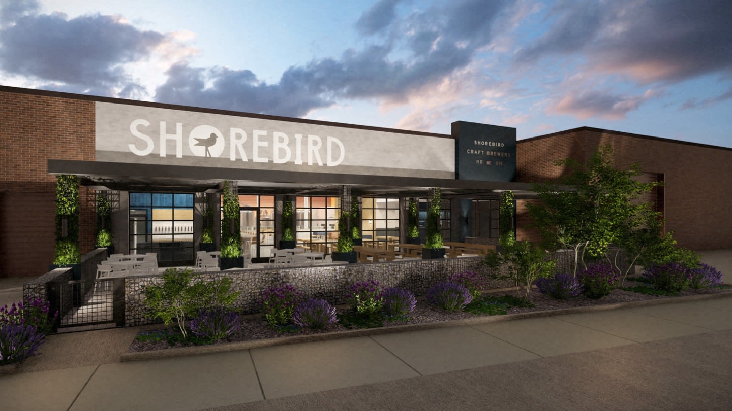
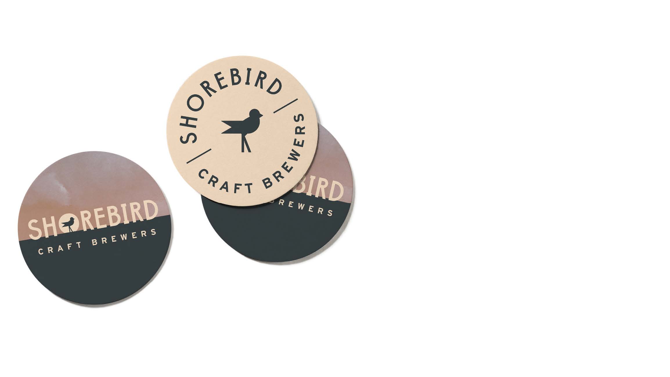
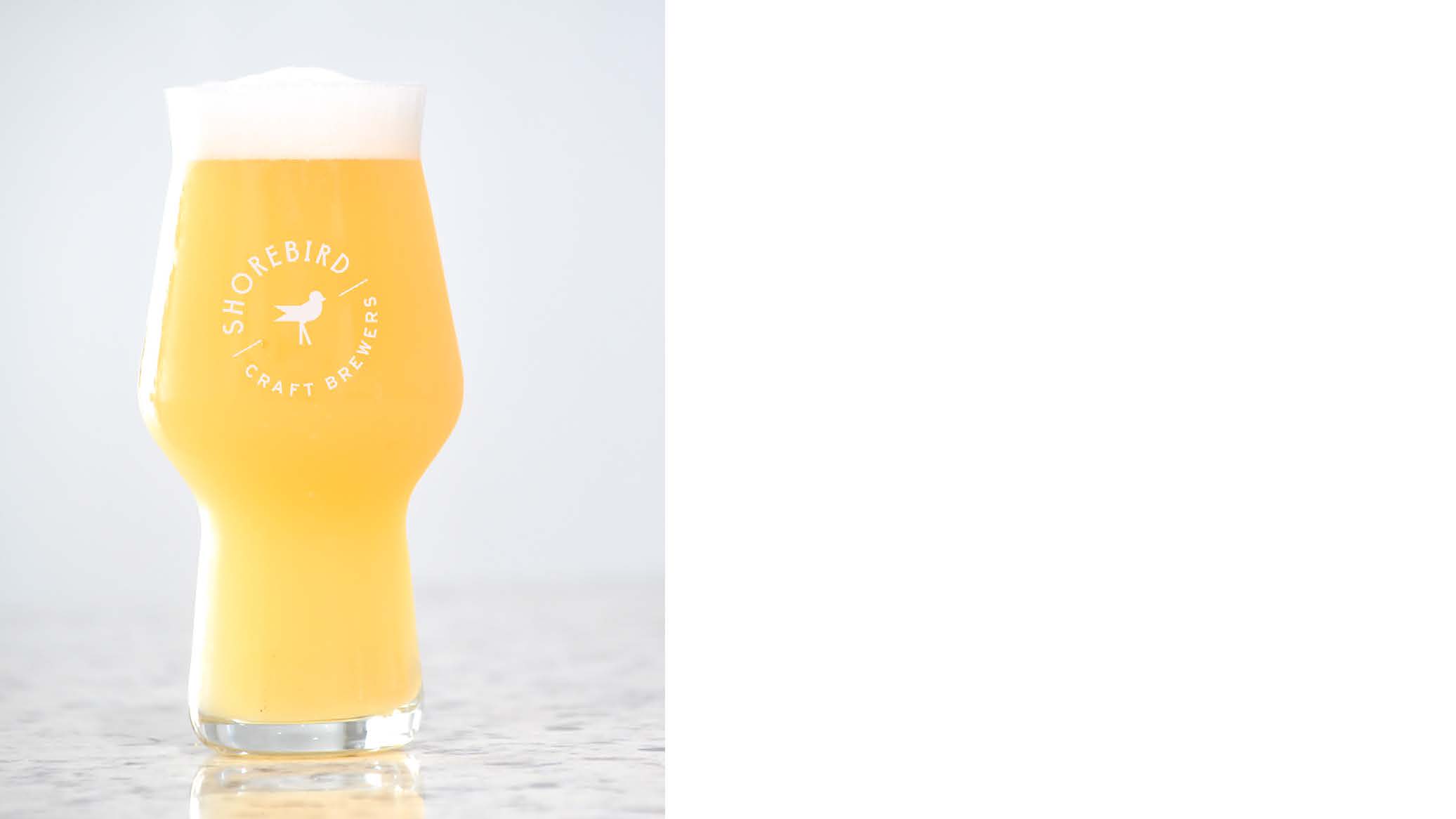
With inspiration from west coast breweries, we incorporated lighter and brighter visuals than competing Rust Belt brewery brands. After presenting several concepts to the clients, they leaned toward a brand identity with clean lines and a simple icon. The straightforward, casual typography and stylized bird conveyed the brand’s personality at a glance. The client’s final choice included the bird icon set inside a sunset, nodding to Lake Erie’s stunning evening views.
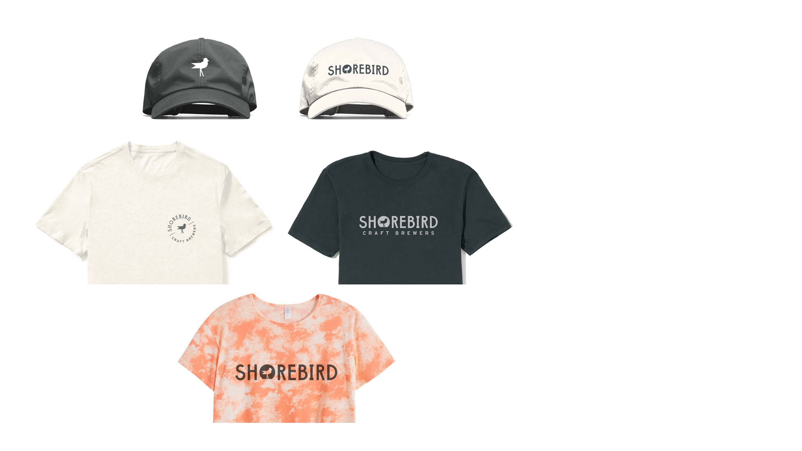
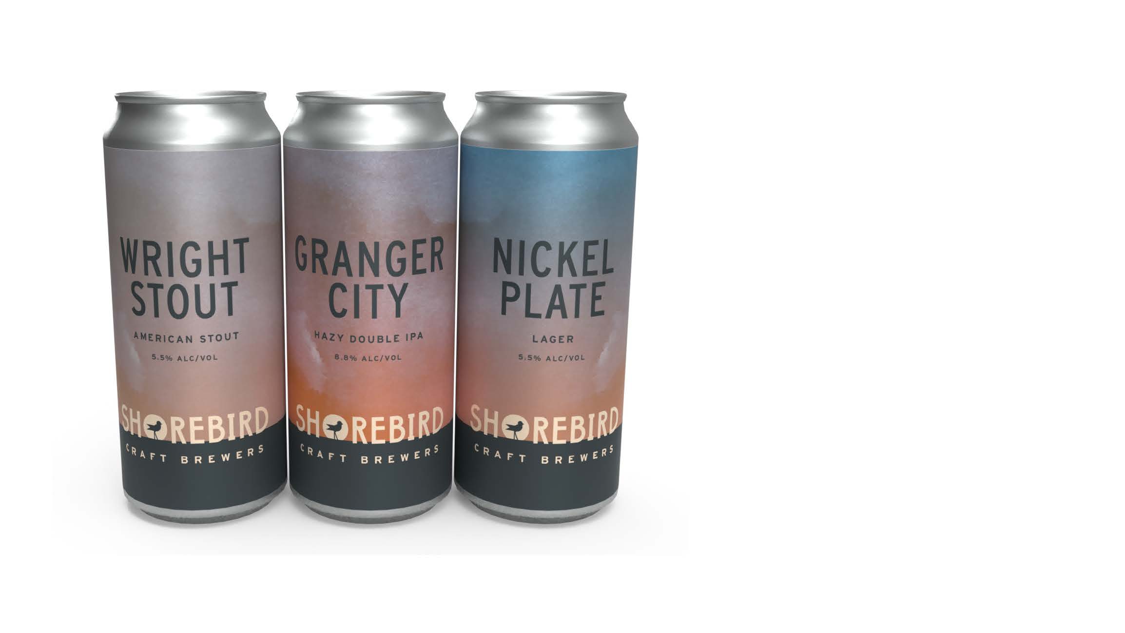
Our team further refined the brand and applied it to cans, merchandise, bar ware and tap handles to display the brand in action.
As the interior designer on the project, we knew from the start how many logo variations were needed and seamlessly integrated the brand with the environment. A flexible, agile brand is important for a business with many variations and applications, from the can designs to large format outdoor signage.


Brewing a Place to Gather
Shorebirds (and the brewery) live near the shore, not on the shore, so it was important that we didn’t include “lakeside” language into the brand or environment. Rather, we incorporated the essence of the lake – pink and orange colors of the sunset sky as wall treatments, pale driftwood-like accents, light flooring and tiles that looked like sand – to mimic the calming nature of being near the water.
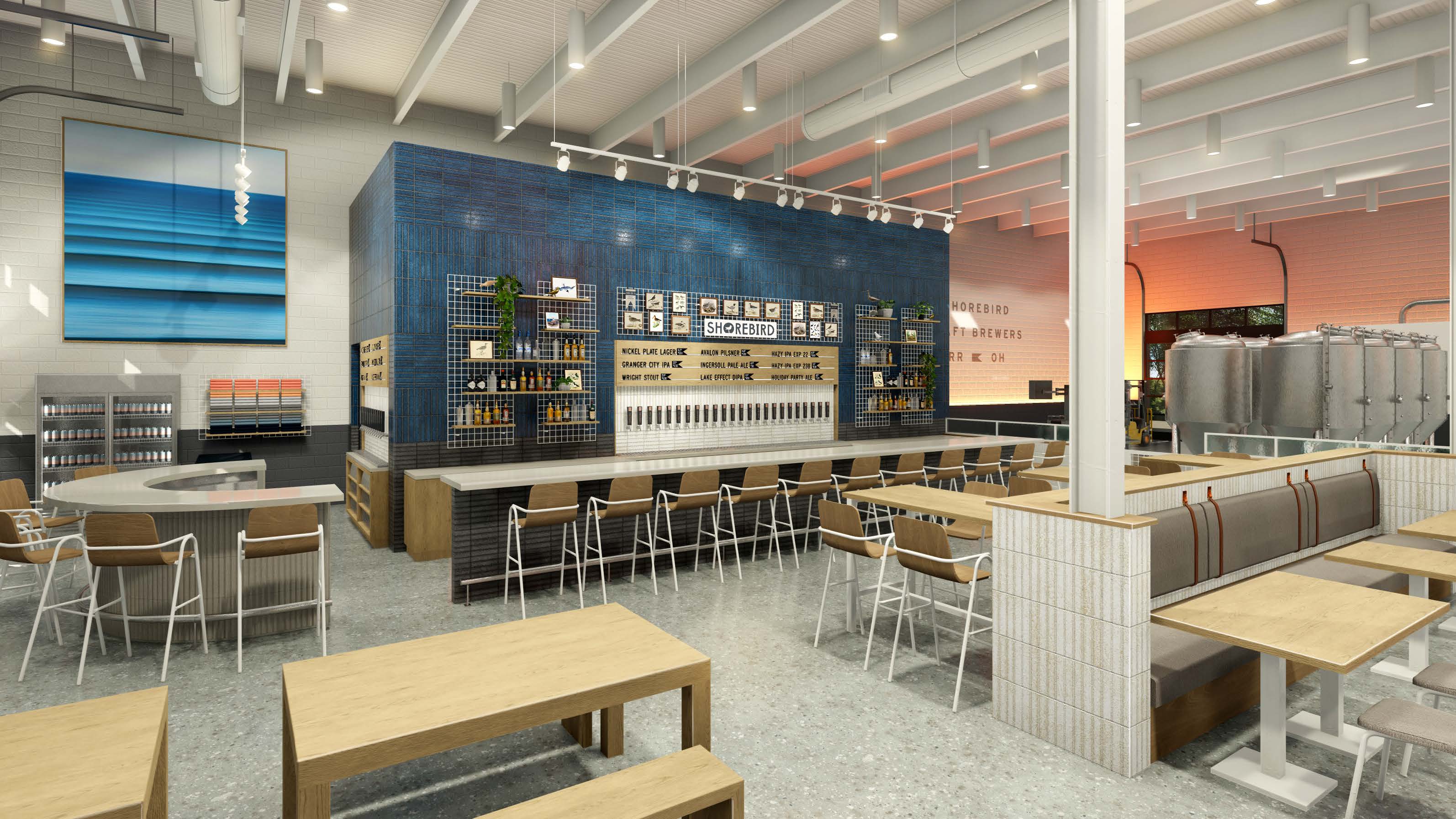
As an extension of the Shorebird brand, the environment had to be open, breezy and inviting. Our team worked closely with the client to incorporate design elements that evoked a sense of lightness and relaxation in a friendly atmosphere.

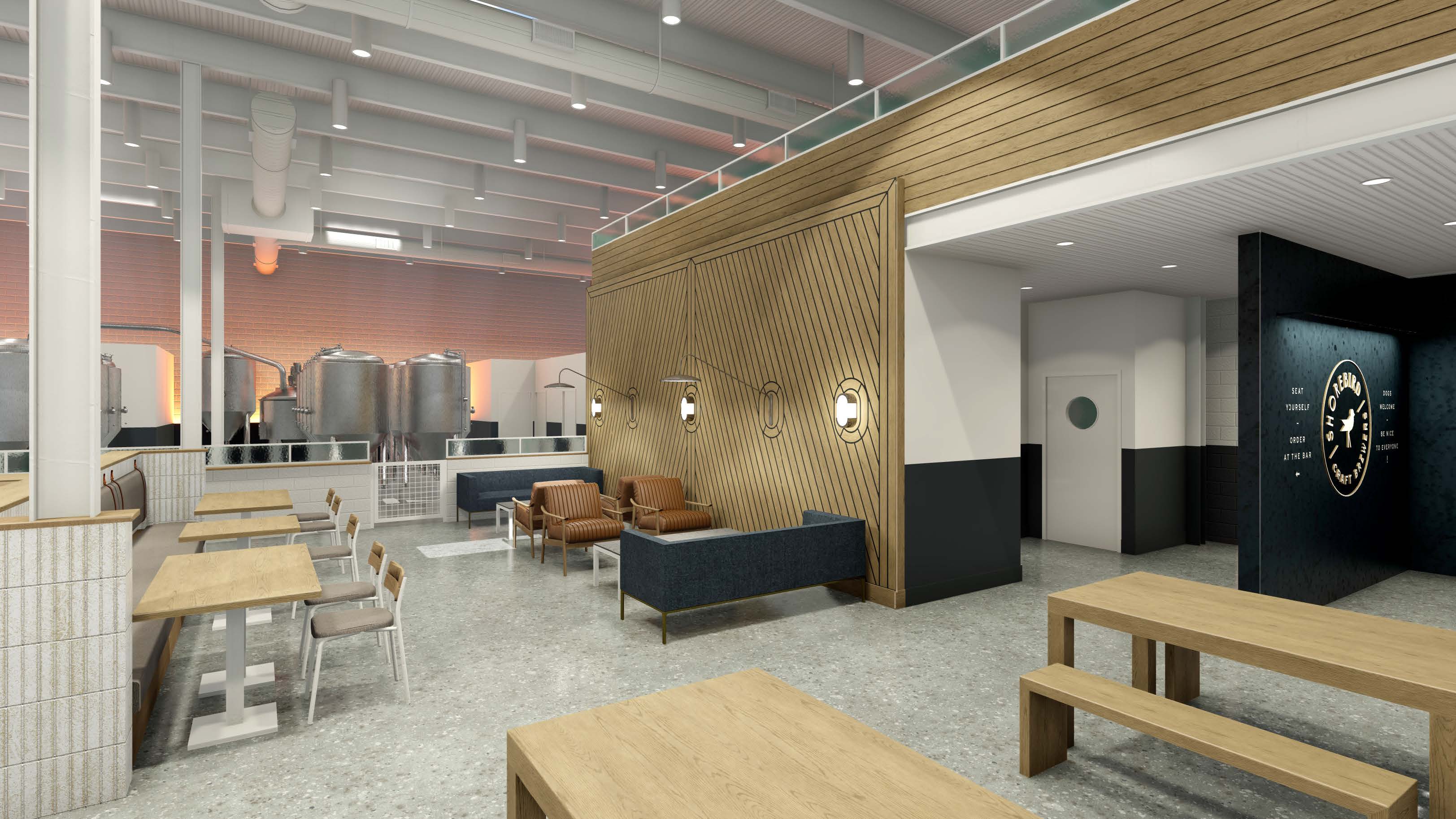


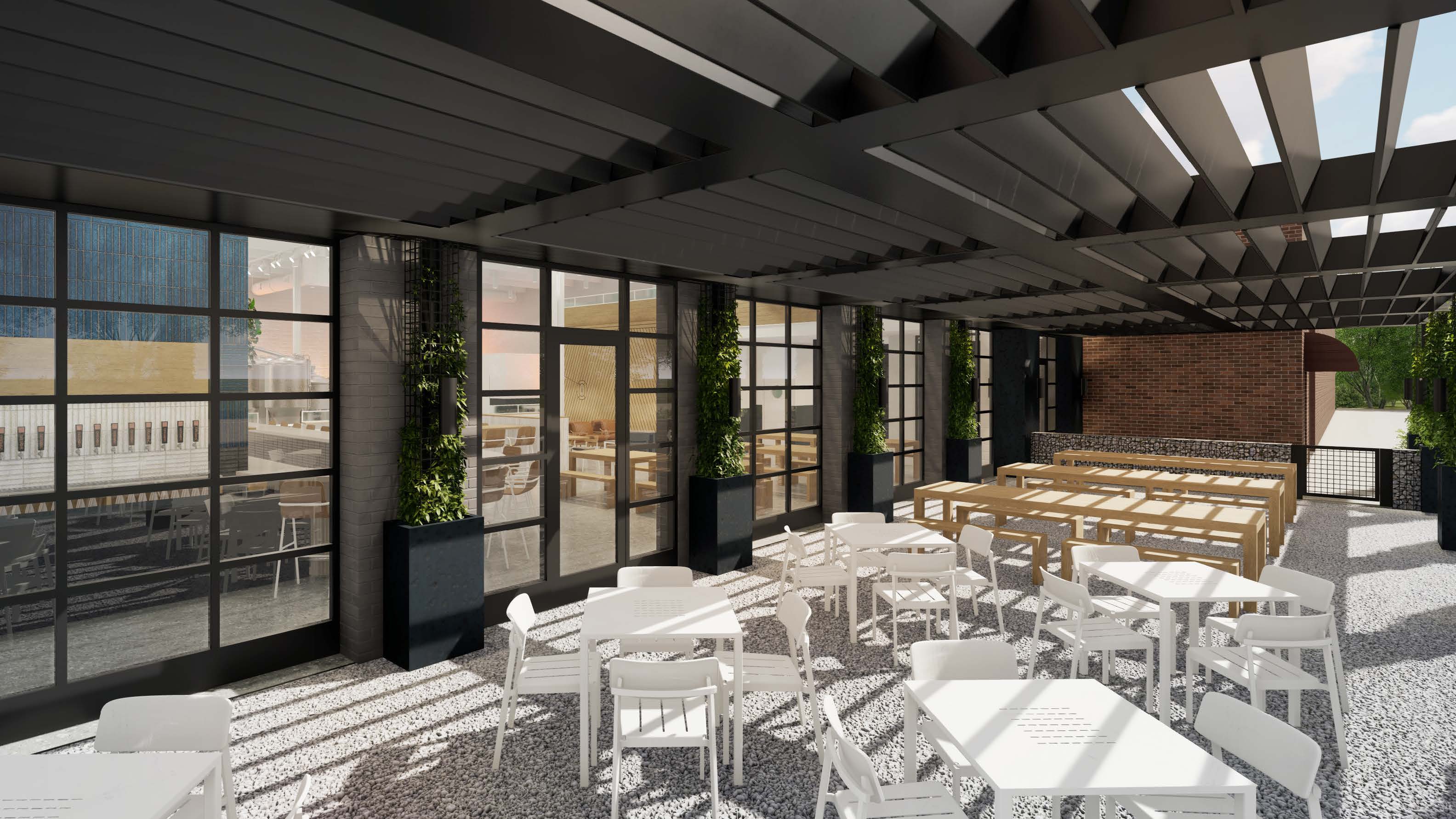
Large, well-lit open spaces
Wood details designed to look like deck of boat
Neutral, beach-inspired colors
Color shifting LEDs mimicked the lake sunset
Audubon Society photos of birds behind the bar
Chairs with thin white legs that nodded to shorebirds
Expansive windows brought the outside in
Plentiful outdoor seating for groups of different sizes
Wood lattice allowed sun through with some coverage
A Concept Grounded Too Soon
The design process took place during the early days of the COVID-19 pandemic when everything from material sourcing to consumer habits was uncertain. The owner of what would have been Shorebird Craft Brewers decided that the exciting concept didn’t make enough business sense to take flight and it was relegated to the pitch graveyard.
A strong brand and visual identity help drive an environment’s interior design. Connect with Richardson, a commercial design firm, to learn more about our harmonious process of branding and interior design.
Photography Credit:
McCall Alexander, DJ Johnson
Any additional photography used in this project is property of its respective owners.